When working with languages, it is important to keep in mind the context in which they exist. While “context” has many different facets, a primary aspect is geography. Geographical (and topographical) context influences things like climate and ecosystem, which in turn influences food and livelihood, which can then affect how languages develop. Languages in geographical proximity can also influence each other as speakers interact.
This means that any understanding of language change and interaction requires that we account for spatial relations between languages/varieties. One way to visualize these relations is via maps, which can be done with GPS coordinates. Last year I was asked to give a tutorial on mapping for linguists, and as I was preparing I realized that things had changed quite significantly since I first made linguistic maps years ago (using QGIS and by building my own mapserver), which has sent me down a bit of a rabbit-hole to learn about some of the newer technological developments. So the remainder of this blog posts is intended to provide an update for 2026 - illustrating how you can map language locations using data from the taggedPBC and several freely available Python libraries.
Choosing languages to visualize
It is worth taking some time before you start mapping to consider what you want to visualize. Are you interested in language areas? Do you want to map word form variants? Dialectologists might be more interested in tools like Gabmap to identify within-language variation, while typologists might want to map grammatical features across languages. Lauren Gawne and I offer some discussion of this in a (somewhat dated) paper, but additional considerations can be found here and here.
For the purposes of this post, we will be visualizing two features: word order and language family. We’ll be mapping languages according to those features using geographical coordinates. Previous research has shown a strong correlation between word order (which we can visualize using shapes) and language family (which we can visualize using color), as well as geographical location (which we can map to spatial coordinates).
Setting up your environment
As with previous tutorials, I’m assuming that you’ve set up a Python 3.10 environment and have some familiarity with writing and running Python scripts (i.e. via a terminal). For a basic setup tutorial, you can follow these instructions.
The following command can be run in your terminal to make sure all the necessary libraries are installed:
pip install pandas openpyxl plotly colorcet requestsThe code below downloads the dataset containing information about the languages we want to map. Here we are using data extracted from the taggedPBC that has been collated with expert determinations of intransitive word order from three typological databases (correlations are detailed in this blog post), and stored in the excel spreadsheet here.
We are using the built-in os and
the requests Python libraries to
handle files, and the pandas
library (with the openpyxl module
for handling spreadsheets) to process the data.
The following code block should download the
file directly to your working directory and load
it into memory.
import os, requests # for file handling
import pandas as pd # for data processing

langdata = "All_comparisons_intransitive.xlsx" # the name of the file containing our data

# check whether the file exists already
if not os.path.isfile(langdata):
    # use the raw GitHub URL for this file
    url = "https://github.com/lingdoc/taggedPBC/raw/refs/heads/main/scripts/data/output/All_comparisons_intransitive.xlsx"
    # fetch the file content
    response = requests.get(url)
    # write content to the local file
    if response.status_code == 200:
        with open(langdata, "wb") as file:
            file.write(response.content)
        print("Download complete!")
    else:
        print(f"Failed to download. Status code: {response.status_code}")
else:
    print("File exists!")

df = pd.read_excel(langdata) # load the file
You might notice that the dataset is somewhat large (~1,100 languages), and in our case we can reduce the spreadsheet to only the relevant features we are interested in, so that we can work with the data easier using our mapping library. This is a generally good practice that can be quite important when working with large datasets, though it is not crucial here.
colstokeep = ['index', 'Name', 'Family_line', 'latitude', 'longitude', 'Noun_Verb_order']

df = df[colstokeep] # reduce the dataset to only those columns we're interested in
Mapping languages
There are several mapping libraries that we
could use to visualize this data. A library that
I used to generate some initial maps, and which
is used in scripts included
in the recipes folder of the
taggedPBC is lingtypology.
This library has some built in functions that
work well to display basic features such points
on a map, as well as functions that can access
various typological databases (like WALS,
Glottolog, and AUTOTYP) directly.
While lingtypology is a great
library and resource, other libraries also
provide ways of plotting geographical
coordinates on basemaps. In some cases, you may
want to map larger regions where languages are
spoken, such as with the newly-released
dataset that provides polygon data for
languages. This and other features require a
more complex setup than
lingtypology supports, and various
mapping libraries allow for greater
functionality and configurability, such as being
able to plot points with both colors and shapes,
which is what I will be illustrating here.
Popular plotting tools include folium,
geopandas,
and plotly,
the latter of which we’ll be working with in the
code below.
Here we are using the simple point-based approach to map the languages we are interested in, but we categorize the points (languages) by two features at the same time: family membership (Indo-European, Austronesian, etc) and intransitive word order (SV, VS, free).
First we import plotly for
handling the mapping, and colorcet
to provide a set of distinctive colors based on
the number of groups in the data. Then we create
a figure based on the dataset we imported above,
using the scatter_geo function.
Each column in the dataframe (df)
contains features, which we can pass directly to
the mapping function using the relevant column
names. Colors differentiate between language
families (roughly 117 in this dataset, including
isolates), while symbols/shapes represent the
different word orders.
import plotly.express as px # the plotting package
import colorcet as cc # the color package

# create the scatter map
fig = px.scatter_geo(
    df,                               # the dataframe containing our data
    lat="latitude",                   # name of the column with latitude values
    lon="longitude",                  # name of the column with longitude values
    color="Family_line",              # language family column dictates color
    symbol="Noun_Verb_order",         # word order column dictates shape
    symbol_sequence=["circle", "triangle-down", "square"], # select shapes
    hover_name="Name",                # name of the language for visualization
    projection="natural earth",       # map projection used by plotly
    title="Languages by Family and Word Order", # title of the map
    color_discrete_sequence=cc.glasbey_dark, # set of distinctive colors (from 256)
)

fig.show() # visualize the output
The mapping function produces an interactive html page by default that opens in a browser, which can be useful for exploring the data. You will notice, however, that the legend is rather busy. This is because the plotting library assumes that we want individual keys for all the data, and in order to create the plot above it combined family membership with word order, resulting in a large number of groups (including a large number of isolates). To avoid overpopulating our legend, we can reduce the keys to only the word order values that we are interested in by splitting out the word order information from each key and combining them.
# filter the legend to only show the unique word order entries
seen_word_orders = set()

for trace in fig.data:
    # plotly trace names default to "Family_line, Noun_Verb_order" (e.g., "Indo-European, SV")
    name_parts = trace.name.split(", ")

    if len(name_parts) > 1:
        word_order_val = name_parts[1]  # extract the word order value
    else:
        word_order_val = name_parts[0]

    # group identical word orders together
    trace.legendgroup = word_order_val

    if word_order_val not in seen_word_orders:
        seen_word_orders.add(word_order_val) # add new word orders only
        trace.name = word_order_val  # rewrite the legend text to just the word order
        trace.showlegend = True      # keep the first instance visible
    else:
        trace.showlegend = False     # hide subsequent traces from the legend
Another observation here is that the basemap is not necessarily ideal. We can make some adjustments to the basemap to show the legend title and change marker sizes, as well as highlight political or other boundaries, as in the following code. You can also get maps from other sources (i.e. Open Streetmap) that may represent other features of interest, such as topography.
# final layout adjustments
fig.update_layout(legend_title_text="Word Order") # change legend title
fig.update_traces(marker=dict(size=10)) # change size of markers

# enhance political boundaries on the basemap
fig.update_geos(
    showcountries=True, countrycolor="RebeccaPurple", # country boundaries color
    showcoastlines=True, coastlinecolor="Black", # coastline boundaries color
    showsubunits=True, subunitcolor="Blue"  # shows state/provincial boundaries where available
)
One nice thing about the interactive web page
that plotly produces is that you
can export the result to an image file, but this
is not necessarily high quality. To increase the
quality of the output, we can scale the download
settings by using a configuration dict.
# high-quality download settings (multiplies pixels by 6 for crisp resolution)
config = {
    'toImageButtonOptions': {
        'format': 'png',
        'filename': 'high_quality_map',
        'scale': 6
    }
}

# display the map using the new configuration settings
fig.show(config=config)
In the resulting web page, I’ve zoomed in to part of the map in order to produce the following static image:
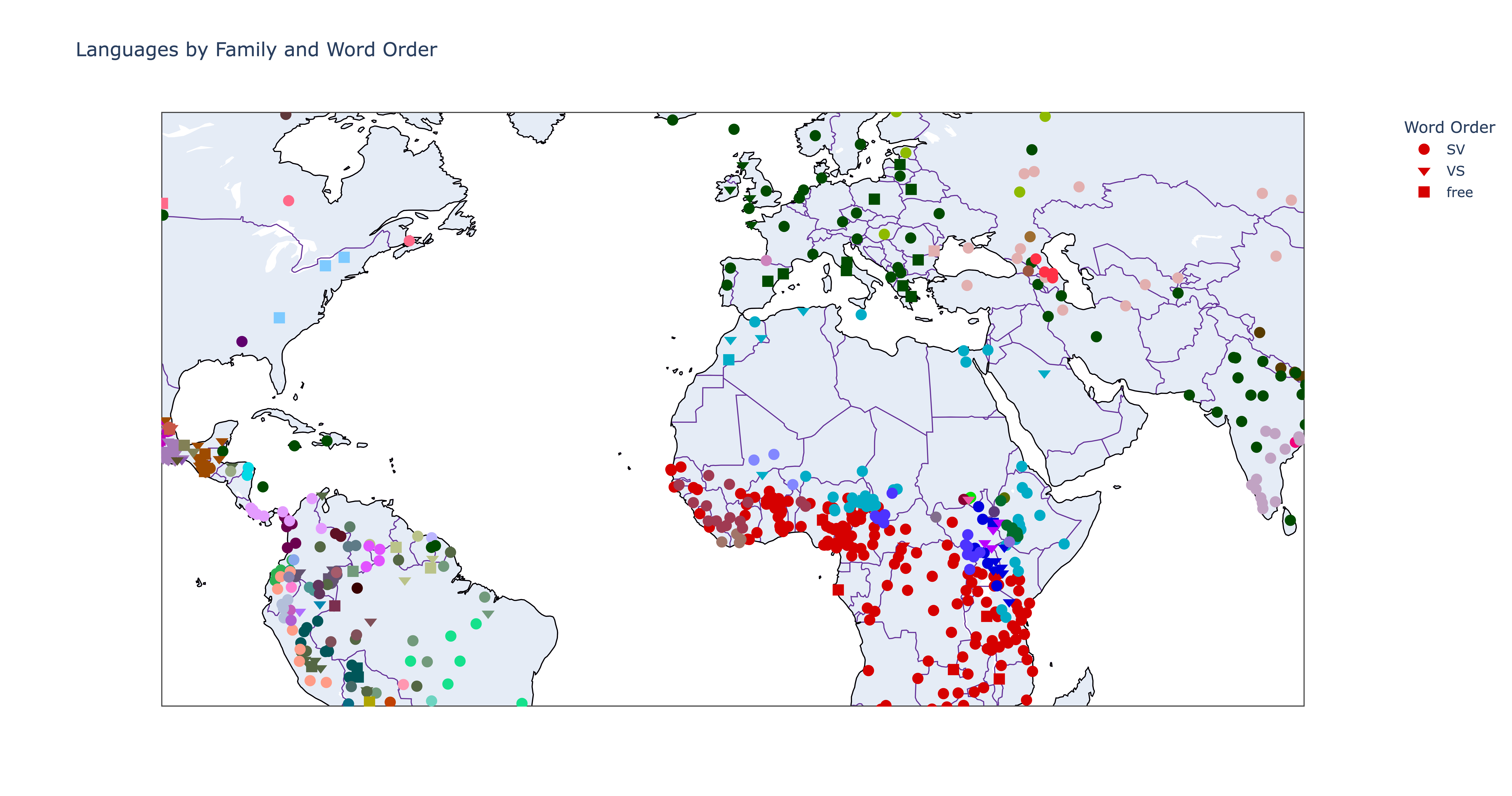
Here we can observe some interesting patterns, namely that the word order (shapes) of different languages cluster to some degree geographically as well as by color, supporting previous observations. However, visual indications are not as reliable as statistical methods, so it is important to conduct other tests, such as I’ve done in another post. As I noted there, an even better alignment is found between word order and average lengths of nouns and verbs, but this is not something that lends itself particularly well to visualization, though I might explore possible ways of doing so in another post.
Conclusion
In this blog post I’ve shown how you can map linguistic features using a dataset from the taggedPBC and Python libraries in order to explore or visualize possible relationships. Some features lend themselves to these kinds of visualizations better than others, and others may need more complex setups than I have presented here. In some cases you may also need to reduce or combine features in order to represent them appropriately in 2-D or 3-D space, and any possible relations should be tested with statistical techniques to reject the null hypothesis. However, being able to visualize relationships can be quite important for contextualizing and communicating findings, and I hope this post has given you some directions for your own work. As always, get in touch if you have further questions or suggestions!