Along the lines of some of my previous posts on tools for linguistic analysis, I thought I’d post a quick update on a Praat script I’ve been working on. While not part of the series of posts I’ve been working on describing my tools and workflow, this particular script is a recent tool that I’ve developed for analyzing and exploring tonal patterns.
As I noted in my post on Praat scripting, the Praat program gives linguists a relatively easy way to investigate the properties of speech sounds, and scripts help to automate relatively mundane tasks. But regarding tone, while Praat can easily identify and measure tone, there are no comprehensive scripts that help a linguist to instrumentally investigate tones in a systematic way. Let me first explain a bit.
What is ‘Tone’?
In this post, I use the word ‘tone’ to refer specifically to pitch that is used in a language at the word or morpheme level to indicate a difference in meaning from another word (or words) that are otherwise segmentally identical. In linguistics, this is a “suprasegmental” feature, which essentially means that it occurs in parallel with the phonetic segments of speech created by the movement of articulators (tongue, mouth, etc..) of the human vocal apparatus.
Tone has a lot of similarity to pitch as used in music, which is why tones often seem to ‘disappear’ or be relatively unimportant in songs sung in languages that otherwise have tone (like Mandarin). Another important piece of information to remember is that there are quite a few different kinds of tone languages. The major tone types are ‘register’ and ‘contour’ tones - often languages will be categorized as having one or the other, but some have both types. African languages tend to have register tone: this means that pitch height (measured in frequency, often by Hz) is the primary acoustic correlate of tone in these languages. Asian languages tend to have contour tone: this means that across the tone-bearing-unit (TBU) the pitch may rise or fall.
There are also languages for which the primary acoustic correlate of tone (or some tones) is not pitch, but rather voice quality: glottalization (i.e. Burmese), jitter, shimmer, creakiness, or length. Languages for which pitch is not the overall primary acoustic correlate of tone are often called ‘register’ languages. Register languages are found throughout South-East Asia.
Measuring tones
The pitch correlates of tones are relatively easy for Praat to identify, as its instrumentally observable correspondence is the fundamental frequency (F0) of a sound. Praat can extract the fundamental frequency as well as other frequencies (formants) that are important for various vowels. Tone researchers often use a script to extract F0, and then apply various normalization techniques to the extracted data, plotting the results in a word-processing program like Excel or by using a more robust statistical tool like R (see this paper or this post for more details, and James Stanford has done some good work on this subject - see his presentation on Socio-tonetics here).
One issue with this approach, however, is that often pitch tracks for each tone are time-normalized along with every other tone. So for example, in image #1 below of Cantonese tones (from this paper), all pitches are plotted across the same duration. This is fine if pitch is the primary acoustic correlate of all tones, but what if duration/length is an important correlate as well? How does a researcher begin to discover whether that is the case?
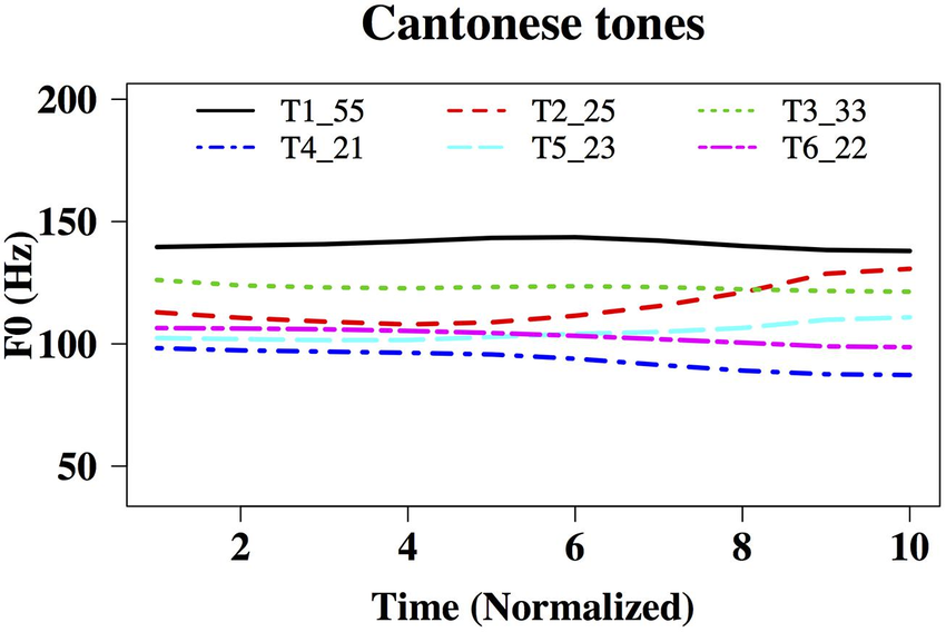
image #1
Script for analyzing tone
The problem I tried to solve was basically this: I was investigating a language (Biate) for which no research had been done on tone, and I needed a way to quickly visualize the tonal (F0) properties of a large number of items. I also wanted to easily re-adjust the visualization parameters so that I could output a permanent image. Since I couldn’t find an existing tool that could do this, and since I wanted it all to be done in a single program (rather than switching between two/several) I created the Praat script that you can find here at my GitHub page under the folder ‘Analyze Tone’. If you look closely, you’ll notice that this scripts incorporates several parts (or large chunks) of other people’s work, and I’m indebted to their pioneering spirit.
There is a good bit of documentation at the page itself, so I’ll leave you to get the script and explore, and will give only a brief explanation and example below. I have so far only tested this script on a Mac, so if you have a PC and would like to test it, please do so and send me feedback. Or, if you’re a GitHub user, feel free to branch the repo and submit corrections.
The basic function of the script is to automate F0 extraction, normalization, and visualization using Praat in combination with annotated TextGrid/audio file pairs. Segments that are labeled the same in TextGrids belonging to the same audio file are treated the same. You can start out by plotting all tracks, in which case all tones labeled the same will be drawn with the same color. Or you can create normalized pitch traces, in which case a single F0 track will be plotted for all tones with the same label. This script creates audio files on your hard drive as one of its steps, so make sure you have enough free space (the size of each file is usually less than 50Kb, but if you have hundreds, they can add up).
In order to start, simply open an audio file in Praat and annotate it with the help of a TextGrid (if you don’t know how, try following this video tutorial). Create a label tier that only contains tone category labels, and add labels to boundaries that surround each tone-bearing-unit. Then save the textgrid file in the same directory as the audio file, and run the script.
The kind of output you can get with this script is shown below. The first picture shows all the tones plotted for a single speaker, and the normalized F0 tracks for each tone are shown in the second picture. Importantly, F0 tracks are only length-normalized for each tone. You will also notice that the second image zooms in closer so that the relative differences between tones can be seen more easily.
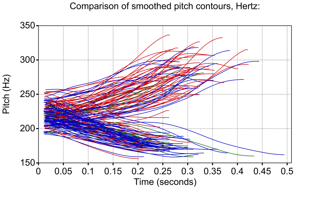
image #2
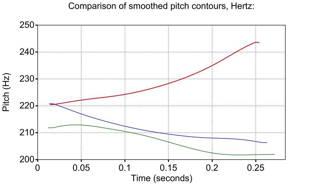
image #3
Reasons for visualization
These kinds of visualizations are important for several reasons.
Tonal realizations often differ greatly both between speakers and within a single speaker’s speech. This is because each individual’s vocal apparatus is different, and also because the articulatory context in which they produce each tone differs. A tonal target produced with a high front vowel [i] and after a dental [t] will be different from one produced with an open central [a] and after a velar [g], at least to an instrument. These differences may average out through normalization, but likely only if A) there are enough tokens and B) they are actually the same tone category according to a native speaker.
An instrument like Praat cannot perceive the differences in the same way that a native speaker can. This is also why Praat can give the wrong measurements of fundamental frequency. F0 is only one of the formant frequencies within a sound wave. If the measurement parameters are incorrect, Praat may measure a different frequency than the fundamental frequency - this is why it is important to set the parameters according to each speaker (male fundamental frequencies are usually found between 75-300 Hz and female F0 is usually found between 100-500 Hz; mean F0 is often around 120 Hz for men and 220 Hz for women due to their different physiology).
Immediate visualization means that incorrect acoustic measurements by Praat can be corrected. At the same time, mixed or incorrect plots for pitch production can be observed and the tokens can be filtered manually by the researcher. Unfortunately the labeling must be done manually, but it is relatively easy to check whether a marginal tone is actually present or at least whether pitch is one of its acoustic correlates.
If you have labeled tones from multiple speakers, it is also relatively easy to see whether differences between tones are actually salient. In image #2 above, for example, we can see that most of the red tones (Tone 1) cluster with a higher (rising) contour, whereas the blue tones (Tone 2) cluster with a lower (falling) contour. A few blue tones have a rising F0 track, which may be outliers. In the lower image #3, we see that normalizing across 100 or so instances of each tone shows little effect from those rising blue tones, which strongly suggests they were outliers.
We can also see in this normalized plot that there is a clear difference between Tone 1 (red) and Tone 3 (blue), but the marginal Tone 3 (green) was questionable for most speakers that I recorded, and in the plot it is virtually identical to Tone 2. If this is true for the majority of speakers, we can conclude that Tone 3 probably doesn’t actually exist in Biate as a tone correlated with pitch.
Of course all of these visualizations need qualification, and further investigation is needed by any researcher who uses this tool - your methods of data collection and analysis are crucial to ensuring that the information you are gaining from your investigation is leading to the correct analysis. But speakers of a tone language will often clearly identify categories and what you need is a tool to make these categories visible to those who may not perceive them.
Future work
I’m hoping in future to expand the coverage of this tool in order to assist with visualizing other acoustic correlates of tone, such as glottalization and creakiness. But I’m not sure when I’ll get around to it. If you are a Praat script writer and would like to give it a shot, please join the collaboration and make adjustments - I’d be happy to incorporate them. For now, though, enjoy plotting pitch tracks, and let me know if you have any trouble!